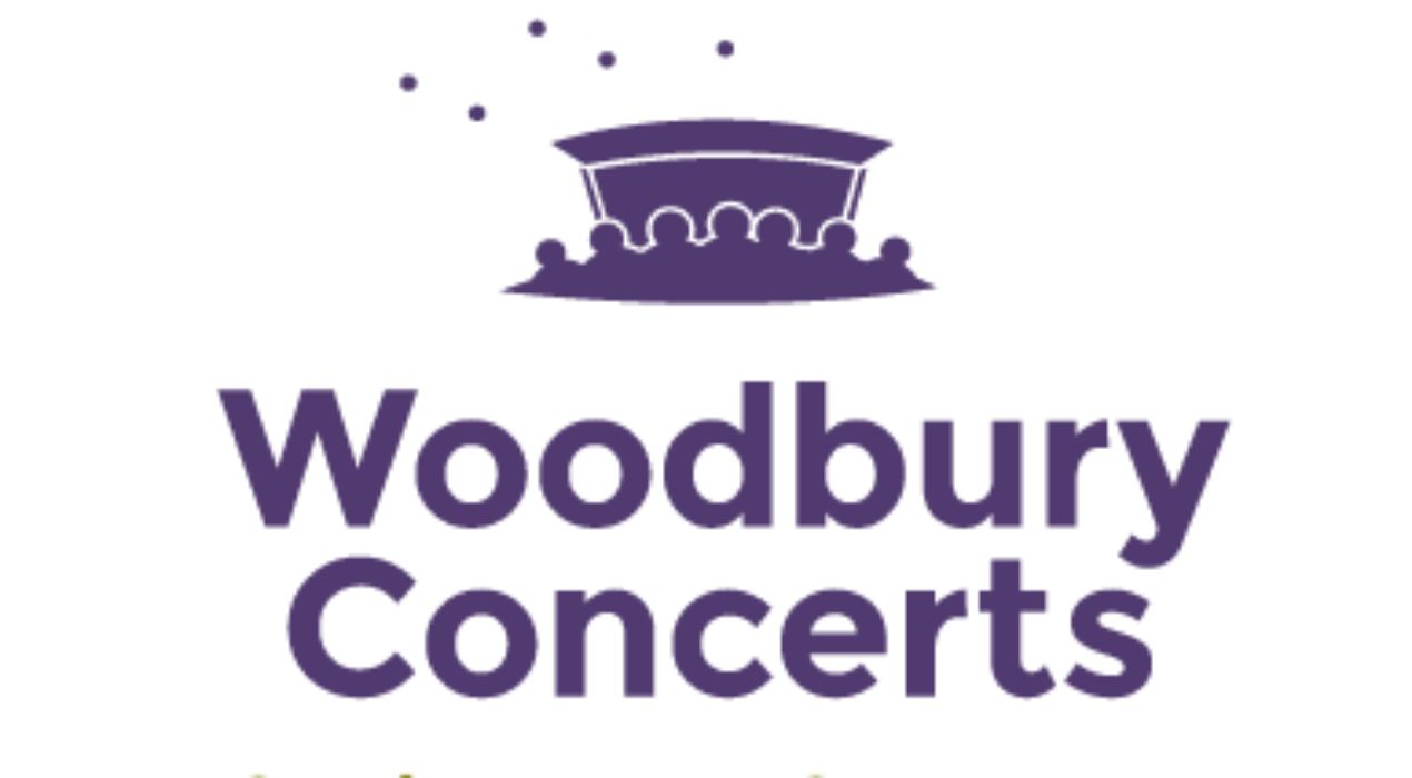
Woodbury Concerts
This is one of those concept logos I just can’t put down. Clean type and concise imagery communicate an atmosphere buzzing with community fun.
Read More ›
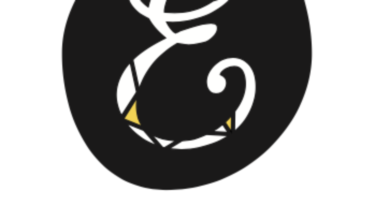
Elysheva Jewelry Logo
A proposed new logo for Elysheva Jewelry, a team of three ladies — a mom and her two daughters — who want to bring fashionable, affordable, high quality jewelry to women everywhere. The design captures their love of funky statement pieces, sleek design, and quality materials.
Read More ›
Mastercam Dynamic Motion Technology
Mastercam has breakthrough technology to save their customers remarkable amounts of time and money, and they needed a mark to carry the message. Combining a few classically dynamic elements, I created a mark able to sit well on the page, as well as reduce to an icon for use in a software environment. View the accompanying style guide. Completed as an employee of DKA.
Read More ›
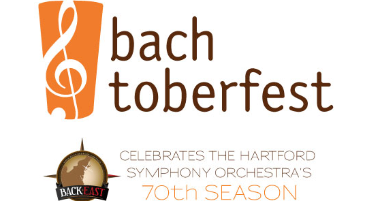
HSO: Bachtoberfest
Back East Brewing Company and Hartford Symphony Orchestra (HSO) teamed up in honor of the HSO’s 70th season by creating a custom craft brew and an exciting schedule of musical events around Connecticut in October of 2013. This provided a unique opportunity to combine the long-standing cultural icon of Connecticut’s HSO with the new trend of craft beer, in one concise logo. The version at left incorporates Back East’s logo. Completed as an employee of DKA.
Read More ›
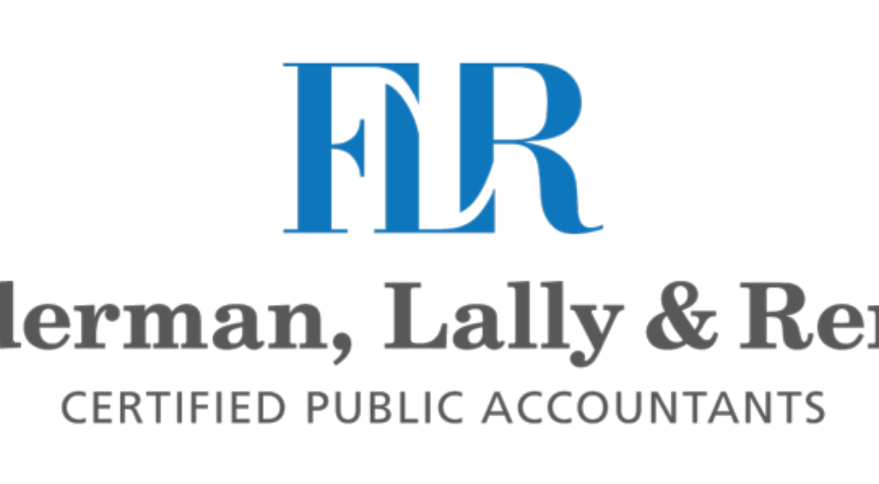
Federman, Lally and Remis
The accounting firm Federman, Lally and Remis has been around for a while. They needed a mark to communicate timelessness and the loyalty they feel toward their customers, with a tone of freshness to indicate that they’re still in touch with the latest technology of their field. This was accomplished by combining a modern sans-serif with sleek type rendering of their initials (by which they’re often referred). Completed as an employee of DKA.
Read More ›
DKA 20th Anniversary Logo
As Dornenburg Kallenbach Advertising’s 20th anniversary approached, I explored different ways of combining their classic logo with the milestone celebration. The resulting logo utilizes the circle of their logo to create a unique and stylized “20,” perfect for a variety of applications, such as the website and a decal for the front door of the office. Completed as an employee of DKA.
Read More ›